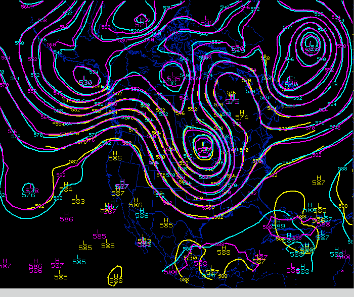
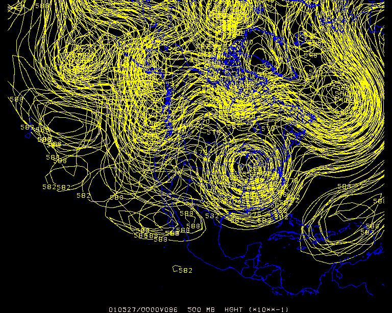
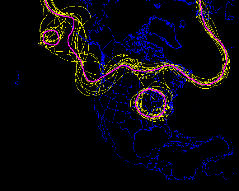
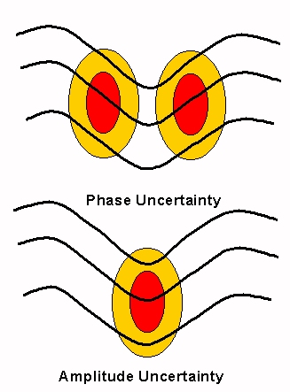
Mulit-model comparison of 500 mb heights from a global model (blue), and two meso models (yellow and purple).
(Loop is in 12h increments from f12-f60 from the 12z cycle May 22, 2001)
A basic training manual targeted for operational meteorologists
"Unfortunately when you most need predictability, that's usually when the atmosphere is most unpredictable." - C. McElroy (NWS)
This training manual is intended to provide basic training on Ensemble Prediction Systems (EPS) for operational forecasters.
This manual attempts to provide sufficient background on EPS to facilitate practical inclusion of ensemble output in the forecast process by addressing EPS terminology, visualization, interpretation techniques and EPS strengths/limitations.
What is an Ensemble Forecast ?
An ensemble
forecast
is simply a collection of two or more forecasts verifying at the same
time. You are probably already an
ensemble
veteran - comparing 500 mb heights or PMSL forecasts from different
models is a form of ensemble prediction.
Mulit-model
comparison of 500 mb heights from a global model (blue), and two meso
models (yellow and purple).
(Loop is in 12h increments from f12-f60 from the 12z cycle
May 22, 2001)
Why do you do this ? Partially because it helps you gain a feel for the possibilities of the pattern evolution and partially to help gage confidence in a particular model solution.
Another example of the ensemble technique is shown below. NOAA's National Center for Environmental Prediction's (NCEP's) Tropical Prediction Center uses a number of guidance outputs to help determine the official forecast of a given tropical system.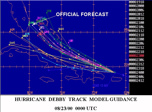
In order to illustrate this, we need to ensure you have sufficient understanding of the LIMITATIONS of Numerical Weather Prediction (NWP).
This will
not require an in depth review of modeling. However,
it is
critical you understand these limitations in order to understand the
concept of EPS.
Deterministic Numerical Weather Prediction - NWP's Current State of Affairs
GENERICALLY model output is produced in the following manner:
1. The initial state of the atmosphere is established using observational data
2. An atmospheric model simulates evolution from the established initial state
3. The model's output is processed and made available for use
INITIAL CONDITIONS ==> MODEL ==> OUTPUT
Obviously a lot of detail has been omitted. However, the above method describes the DETERMINISTIC approach to NWP - a single forecast (estimate of the future state of the atmosphere) obtained from a single established initial state of the atmosphere.
Although the "deterministic" approach has served us well, it is steeped in error and will NEVER provide a perfect forecast. That's right - NEVER - due to 4 primary reasons:
1. Model equations do not fully capture ALL processes occurring in the atmosphere The equations in a model deal primarily with wind, temperature, and moisture. Some equations are so highly non-linear it would take the fastest super computers too long to process and make available output in an operationally timely fashion. Therefore, some of the complex terms in the equations are parameterized (i.e. - boundary layer processes, convection, friction, heat exchange, etc.).2. A model can not resolve atmospheric processes and features smaller than certain thresholds
Consider a model with grid points 10 km apart horizontally - no feature smaller than 10km can be resolved. The model misses any change occuring between grid points. Over time such errors can accumulate and become the dominant signal in the model output.
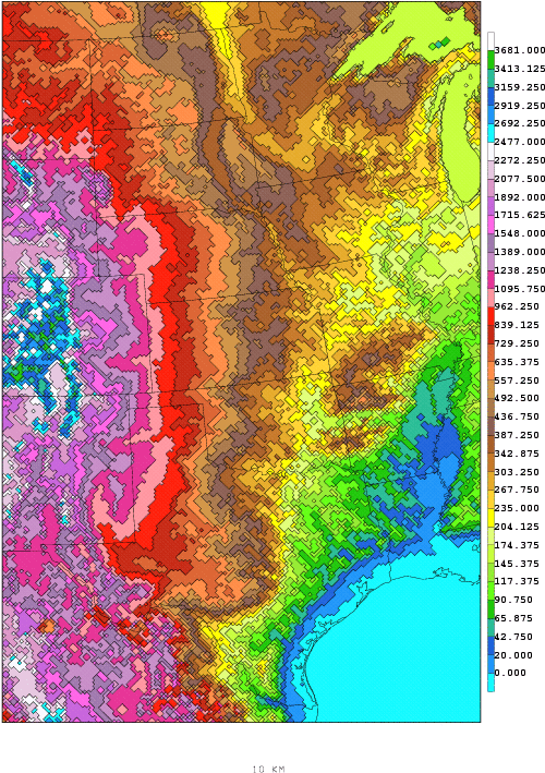
Topography
used in the 10 km Eta. Any
changes
occurring between grid points will go unnoticed by the model.
3. Lack of comprehensive initial data
An observational network covering every point over the globe horizontally or vertically does not exist. Conditions between observation sites are ESTIMATED. Satellite based methods for obtaining observations do NOT fill in all the gaps. Further, for a variety of reasons, observations are not always taken or transmitted.
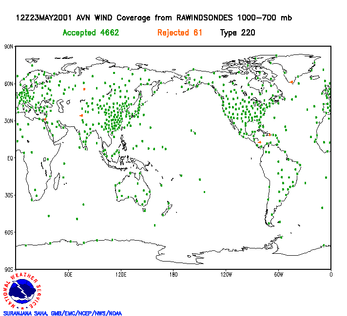
Wind
data from rawinsondes used to help initialize the global model from
1000
to
700 mb (12z cycle May 23, 2001).
Red dots represent
data deemed unusable by the analysis scheme. Note the lack of
data over the oceans and the poles.
4. Accuracy and quality of initial data
Did you ever hear of man named Lorenz ? Back in 1961, Edward Lorenz ran a simple model out to an arbitrary forecast hour. Returning to continue his experiment some days later, he wanted to run the model out to a much longer lead time. Trying to save time, he used output from half way through the previous run as his initial conditions.
Since some of the new run overlapped the last half of the previous run, he fully expected the "overlapping" output to be identical. He was surprised to see the overlap from the new run quickly diverged from the previous run. Ultimately, the divergence in solutions was attributed to Lorenz entering his initial data in the "overlap run" out to only 3 decimal places - rather than to the 6 decimal places provided by the original run's output.
Thinking they were inconsequential, Lorenz thought he could drop the extra 3 decimal places. He discovered in dramatic fashion inaccuracy of initial data ultimately leads to "errors" which grew in magnitude and dominated the forecast output.
This demonstrates observational data used by a model must be accurate out to an infinite decimal place as a prerequisite to produce a perfect forecast. Currently our technology does not allow us to measure any atmospheric quantity to that level of precision.
Summary of
primary sources of error using the deterministic method of modeling
1. Equations
used by a model do not fully capture processes in the atmosphere
2. Model
resolution
is not sufficient to capture all features in the atmosphere
3. Initial
observations are not available at every point in the atmosphere
4. The
observational
data can not be measured to an infinite degree of precision
The above 4 reasons illustrate why the deterministic method of modeling will ALWAYS provides a forecast containing error.
Let's assume
limitation 1, 2, and 3 above have been magically overcome - not an
unreasonable extroplation based on recent advances in technology.
We are still left
with never knowing the TRUE initial state of the atmosphere because of
our limitations in obtaining an infinitely precise observational
measurement
(limitation 4
above). The BEST we
can
do is obtain an initialization that contains error.
Not all error
is incorrectable - eg. linear error is correctable. Consider
shooting
an arrow at a target. Accuracy of your shot is a function
of your aim and distance to the target. If you are consistently
shooting "low" it is a fairly simple matter to correct your error by
aiming higher.
 =
=  ???
???
A pretty bleak prospect was raised in the last section - wouldn't you agree ? Is there any light at the end of the tunnel ? Indeed - there is actually a method to account for the effect of errors in the initial conditions of a model.
A complex set of equations called the "Liouville Equations" actually account for the uncertainty in the initial conditions. These equations produce not just a single forecast, but a set of forecasts (a full distribution of possible forecast states) - given a range (distribution) of possible initial states of the atmosphere.
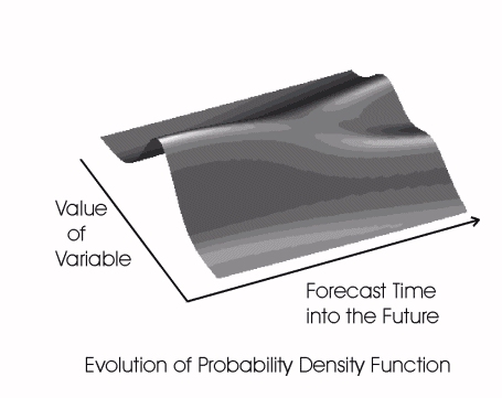
Both the input and the output of these equations are in the form of a Probability Density Function (PDF). For simplicity and for now think of a PDF as a Gaussian or Bell curve.
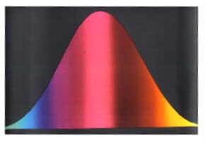
Let's say the
above
figure
represents a f48 PDF of 850 temperature forecasts over Boston MA -
where
-5 Deg C is on the left and +5 Deg C is on the right - obtained from
the Liouville equations. The Liouville equations provide a
PDF encapsulating what will verify.
Somewhere in this range is indeed what will verify. Although the whole range of values is possible to verify, the likelihood of verification is proportional to the area under the curve.
Hopefully you can see the value in obtaining forecast information in this form. A forecast PDF allows us to extract useful information to support operational forecasting such as values most likely to verify, averages, ranges of possibilities, probabilities, thresholds, etc.
When will we utilize the Liouville Equations operationally ? Maybe not in our life time. The Liouville Equations are SO complex even the most powerful super computer would take too long to process and provide output in a timely fashion. Until our computational ability reaches that level we will employ different methods to produce forecast PDFs. The goal is to create PDF's having a strong likelyhood of capturing what will verify.
Until then we are
relegated to a simple and relatively crude method for generating
initial and forecast state PDFs.
Our goal is to
produce a forecast PDF containing what will verify - without the advantage
of the Liouville equations (based only on a single set of
observations).
Therefore we need to synthetically generate
multiple plausible initialized states of the atmosphere. Consider
the
following
image:
The more
plausible
initializations you gather, the better chance you have of resolving the
initial state of
the atmosphere (in a probabilistic sense). By "plausible" we
mean initializations consistent with observations AND the resulting
first guess analysis (and within the expected error of
both).
This is why there is low confidence in a forecast derived from the deterministic method. The deterministic method technically has an initial and forecast PDF comprised of ONE member. By itself, you have no idea of what chance a deterministic forecast has of verifying.
The goal is to obtain a sufficient sample of initializations to help describe an initial probability density function for any atmospheric quantity (like height, wind, humidity, temperature, etc.). This would then lead to a forecast PDF for each quantity.
Here is an arbitrary set of 10 distinct and plausible observations (initializations) for 850 mb temperatures over Boston, MA.

A initial PDF can be extracted from this information by plotting the frequency of a member falling withing a temperature range.
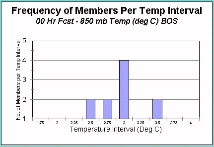
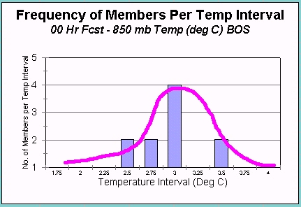
If you drew a curve that fit this histogram and set the area under the curve equal to 1 (purple curve in right image), you would have the initial PDF for 850 mb temps over Boston.
Did you notice something ? Ideally we want an infinite number of initializations at Boston to best describe the initial PDF of 850 mb temperature. But we dont have an infinite number, in fact we usually only have ONE !
So what do we do
now ? We can simulate
different
plausible initializations by perturbing the one available set of
initial data typically available to us.
How do we "perturb" the one initial data set we have ? What parameter, what level ? There are a variety of methods and they all introduce perturbations in at least three dimensions. Some perturbations dampen out quickly in the forecast and don't end up leading to significantly different forecast solutions. Others introduce a wildly different and implausible solution. Simply put the strategy is to perturbate the initial conditions so the differences lead to different yet plausible forecast states of the atmoshere.
But then we must make a big assumption - our synthetically derived initial PDF captures the aspects of the true initial PDF.
Holding this assumption as true, we can obtain a forecast PDF by running a forecast off of each synthetic initialization.. or in our case each perturbed initialization.
And voila ! We get a forecast PDF derived from the same number of members as were in the initial PDF.
Now we have to make another assumption - the forecast PDF matches the frequency of occurence in nature. In reality however, we don't know this until we conduct verification.
The error inherent in any single initial data set forces us to produce multiple distinct initializations in order to capture the essence of a true initial PDF.
We assume that our initial PDF captures the aspects of a true initial PDF.
From the initial PDF we obtain a forecast PDF.
We assume the forecast PDF of the parameter will match the frequency of occurence of that parameter (over time).
From the forecast PDF we obtain more reliable output to support operational meteorology than that obtained by deterministic methods.
Each member from the forecast PDF is considered a member of the ENSEMBLE of forecasts.
III. ENSEMBLE TERMINOLOGY AND GENERATION
Basic Terminology
ENSEMBLE forecast - A collection of individual forecasts valid at the same time.
MEMBER - An individual solution in the Ensemble.
CONTROL - The member of the ensemble obtained from the best initial analysis (the Control is usually what is perturbed to produce the remaining members in the ensemble).
ENSEMBLE MEAN (or MEAN) - The average of the members.
SPREAD (or
“uncertainty”)
- The standard deviation about the mean (also known as the
"envelope
of solutions").
How do the members of an ensemble differ from each other ?
That depends on the method chosen to generate the members of the ensemble. Recall that we simulate different initializations by perturbing the best initial analysis available.
For example you
may
bump up the temps at the surface by .1 degree C, or lower the heights
at
500 mb by a certain value, etc. Those slight changes to the
initial
conditions will in essence produce an initial PDF and ultimately lead
to
different forecast solutions. However, the
perturbation process is not nearly that simple and arbitrary.
The perturbations must lead to an ensemble of solutions exhibiting sufficient and REALISTIC spread to be valid. Some perturbations get damped out early in the forecast and never lead to a different solution as compared to the Control member.
Therefore, it is not sufficient to have a 10,000 member ensemble if all the members lead to an identical solution. At the same time, it is not ideal to have a 10 member ensemble with solutions exhibiting no correlation to what verifies.
Ideally the
output
will produce significant difference in solutions whose forecast
distribution
matches the actual frequency of occurence.
You can
also obtain a forecast PDF by rerunning the model at different
resolutions. Whichever way the
model is rerun, the model is rerun only as often as computing resources
allow.
The number of
perturbed members in the ensemble is usually a function of the
computational resources available to both generate a member and then
run the member out to a target lead time.
IV VISUALIZATION AND INTERPRETATION OF ENSEMBLE OUTPUT
Ensemble output contains information from multiple model solutions; and good grief - it takes long enough to view output from just one run ! How can we possibly view and utilize this data in a coherent and operationally practical manner ?
Consider the NCEP Global Ensembles that have at least 10 members per cycle.
If you wanted to view the 96 hour forecast for 500 mb heights, you could plot all members on one map.
However, that would be a busy display and frankly - useless operationally. We need to consolidate this information in a more user friendly manner.
One way to do this is to plot just one contour from each member on the same map. But which contour value do you choose ?
It depends on which parameter you view. For example, for 500 mb you would need to select a contour that captures most features of the pattern.
For example, here is the same data as in the previous image, but only with the 564 dm contour plotted.
You can extract a lot of information from these kinds of plots. You can immediately discern where the ensemble is showing more predictability (where the members tend to lie close together) versus where the ensemble is indicating less predictability (where the members deviate from each other).
These are known as spaghetti plots for obvious reasons. If you loop spaghetti plots through forecast hour, you typically see all the members lying on top of each other in the early forecast hours and then slowly diverging from each other as forecast hour increases. This is because uncertainty tends to increase with forecast time.
Some forecasters perfoer to view the synoptic detail within the individual ensemble members by plotting output from each member on a "postage stamp" sized image. Each image from each member is displayed along side each other on the same screen. The small sizes of the images allow the forecaster to view the EPS output all at once.
Sometimes the ensemble members tend to group themselves into two or more solutions. For example in the image above the ensembles cluster in two solutions off the Pacific NW coast of the U.S. (a trough south of the Aleutian Islands and a trough off the Pacific Northwest coast of the U.S.).
CLUSTERING is an automated method that identifies and extracts like members and derives output from these like solutions (of which there are different methods to identify clusters).
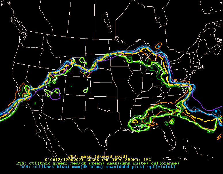
Continuing on with the above image, if we overlay the average of all the members at the 564 dm interval (the ensemble mean) on top of the individual members, we can more easily see how close the individual solutions line up with the mean (purple).
This technique is used to subjectively ascertain the spread (the standard deviation) of the members about the mean.
Notice over Newfoundland how close the members (yellow) lie to each other. There is little deviation of the members from the mean (purple).
The ensembles suggest that there is low uncertainty (or spread) with the trough over the Atlantic. But notice the same is not true south of the Aleutian Islands.
There is a high
degree
of variability (the spread is high) and therefore your confidence
should
be pretty low in this area with the mean.
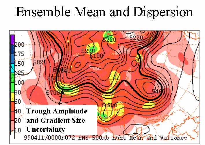
A word about the ENSEMBLE MEAN
Before we continue, we should point out that the ensemble mean acts as a flow dependent filter.
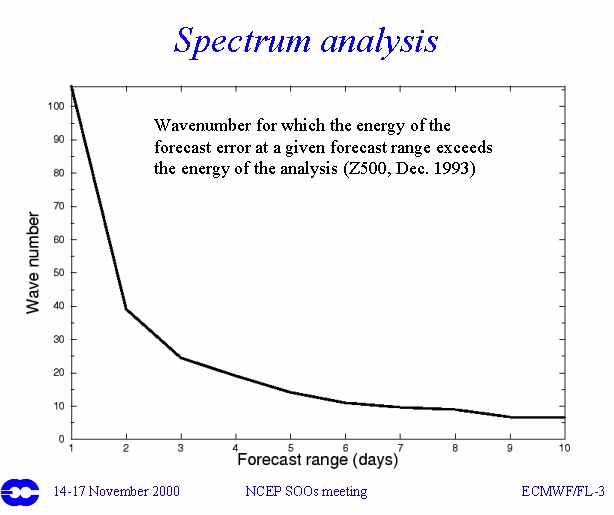
The graphic above illustrates the wave number for which the energy of the forecast error exceeds the error of the analysis by forecast hour.
By day 7 we can't model any feature above wave number 10 with any skill.
The ensemble mean automatically filters out these smaller scale (high uncertainty) features as a function of pattern.
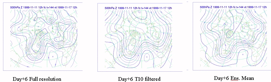
The plot on the left shows the Day 6 500 mb forecast from the ECMWF. The middle plot shows the same plot filtered down to wave number 10.
The ensemble mean for this plot is on the right and provides a similar result to the filtered output.
One downfall to the ensemble mean is that if the EPS output supports two or more clusters of solutions, the mean will combine these solutions and remove this information from the forecaster.
For 500 mb
heights,
the NCEP ensemble mean has been found to over the long run verify
better
than any one particular member in an ensemble once you get out past
84/96
hours
(more about that in the Verification section).
PLAN VIEWS - ENSEMBLE MEAN AND SPREAD
If we shade the Standard Deviation you can quantify the spread by color. For example, the plot below allows you to view to two important pieces of information from the ensembles.
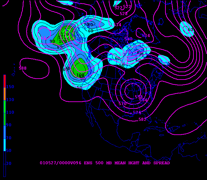
Viewing the ensemble mean and shaded spread NEXT to a spaghettit plot of the same parameter is a good starting point when viewing EPS output for mass fields.
Can we utilize
the ensemble mean strategy for other fields ? Certainly, but you
need to be careful.
Here is an example of the ensemble mean and spread for a PMSL field.
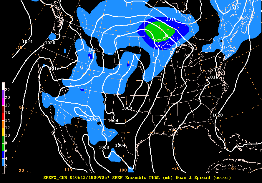
The mean (white) from the ensemble of the PMSL field and the spread (shaded) are both plotted in millibars (mb). Note how little spread exists with the area of low pressure in the plains.
The only spread of significance is in the gradient region north Minnesota. This uncertainty arises from differences in solutions with the gradient between the area of low pressure in the plains and the high over Hudson Bay (there is actually low uncertainty with the low and high pressure centers).
The spread is 6 mb north of Minnesota suggesting that the mean 1008 mb contour running through Lake Superior into Canada has a spread of +/- 6 mb.
This means that some of the members of the ensemble had the high nosing further south while the other members didn't have the high nosing as far south.
Generally interpretation of the spread pattern can be associated with timing and strength.
Basic
interpretation
of spread displays (dark contours represent ensemble mean and shaded
areas
are spread)
KEEP IN MIND that small differences in a region where the gradient is large can be very significant, whereas large differences where the flow is flat may be less meaningful.
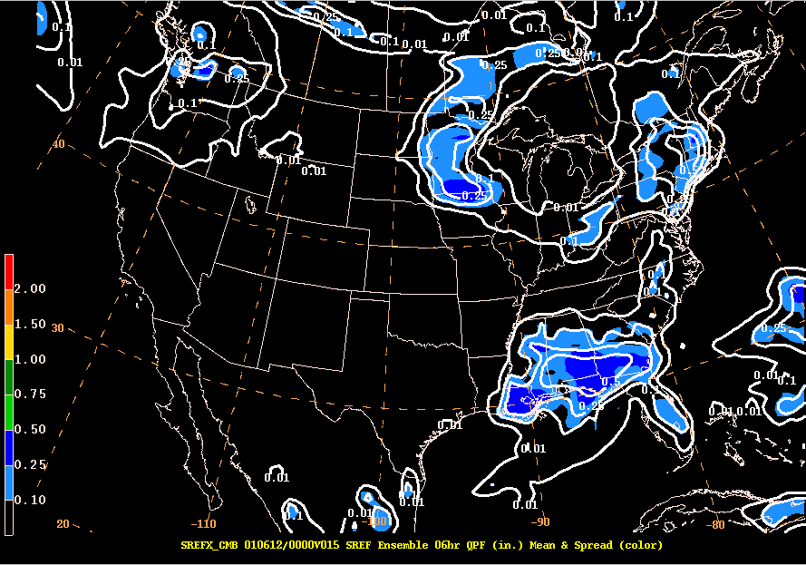
Here is another example of ensemble mean and spread, but for 850 mb temperatures (from the Short Range Ensemble Forecast output back in 2001).
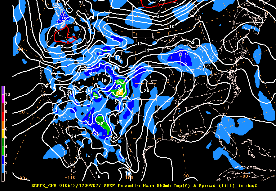
The contours are 850 mb temperature plotted every 2 degrees with shaded values representing the spread (both in degrees C).
Notice the red contour of 0 C. Also take note of the large values of spread in the mountains due to the 850 mb surface intersecting the ground and giving a noisy signal.
In Wisconsin the 16 degree C isotherm has a 2 degree spread. This is interpreted such that the ensemble mean of the temperature is 16 degrees C with a variance of +/- 2 deg C.
Or you could think of this as a region where the temperature is likely to be between 14 -18 degrees C with a most likely value of 16 C.
Another use for the spread is for potential spatial coverage of a field. In the above figure, you could utilize the spread to indicate how far north or south the 16 degree isotherm could actually verify. Think of how useful this could be in winter with a 0 Deg C isotherm. The spread under a freezing line would help highlight an area with potential for mixed precipitation.
The above example illustrate the use of the ensemble mean and spread, but it in no way implies spaghetti plots should be ignored. In the above example, you can use the spaghetti plots to help identify why the spread is depicted as it is in Wisconsin.
As you can see the spread in Wisconsin originates from the difference in location from the differences in how the members are generated. At the time the SREF was comprised of Eta members (in different shades of green) and RSM members (blue/purple shades). In the example above the ETA members were forecast to be further south than the RSM members.
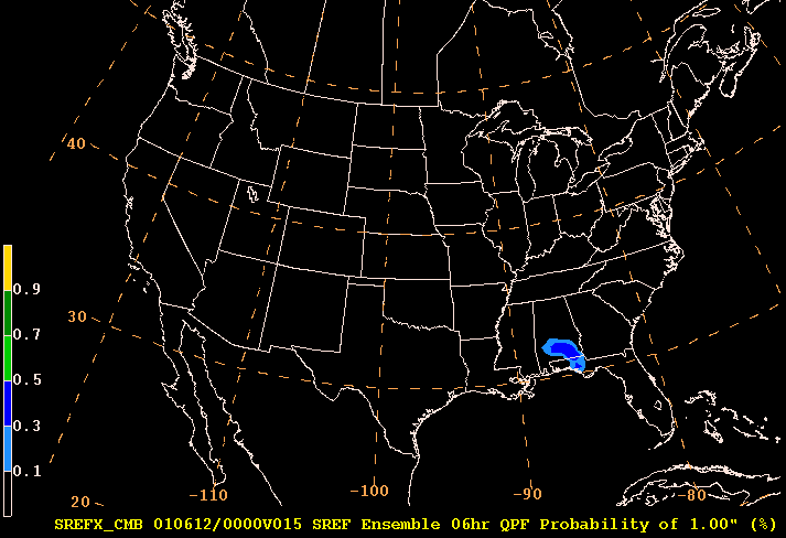
One more example. Here is a plot showing the mean six hour QPF in white and the spread shaded (both in inches).
The mean QPF in southern Minnesota suggests .25" is most likely to occur. Yet the spread is +/ .25" ! The ensembles suggest that area at that forecast hour could see anywhere from 0-.50" ! So southern MN could get nothing or a half inch.
Since a gridded field of QPF may have zero for a values over many points, employing the technique of the ensemble mean and spread may yield meaningless results.
Here is an example of such a situation.
Consider a 4 member ensemble forecast of QPF over a square grid 100 km on a side.
Let's say that each member forecast just one convective cell, but in a different location on the grid (so there is no overlap of QPF between members).
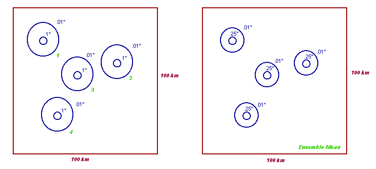
Since none of the members QPF actually overlap (left image), the ensemble mean (right image) would then be the values on the left image divided by 4.
This would yield 4 watered down maxima (and a basically useless tool to help you forecast) as opposed to one bulls eye located in the centroid of the 4 members.
Diagnostic fields such as divergence will also suffer the same fate by employing the ensemble mean and spread technique. It may be more optimal to derive a diagnostic field from a ensmble mean mass field.
Different visualization techniques are required for gridded fields such as QPF, especially when viewed over a large domain.
One useful way to visualize ensemble output of QPF without using the ensemble mean is by "deciles".
For example, we could display to the forecaster where on this grid 60% of the members displayed at least .01" of precipitation.
Then we could overlay on top of that where 60% of the members displayed at least .10" of precipitation on that grid.
We would then do the same for remaining thresholds (.25", .50", 1" etc.).
Here is an example of the 6th decile (60%) plot for the previous ensemble/spread image. The decile values are shaded and the mean is contoured in white.
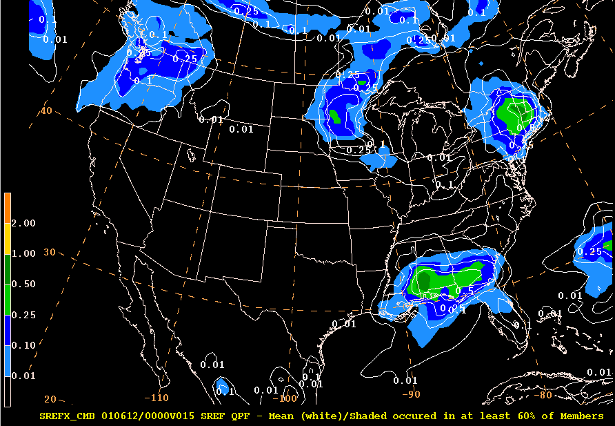
Notice the shading in southern Wisconsin next to the border of Iowa. There is none ! That means that at least 6 out of 10 members in the ensemble failed to meet the criteria of producing a forecast of at least .01". Note however, that this method tended to concentrate the higher amounts in west Wisconsin.
These plots also in a second hand way allow you to assess the uncertainty WITHOUT running into the problem you get when averaging discontinuous fields. Where you see no shading under the mean values, the uncertainty is very high (and vice versa).
So why use 60% (the 6th decile) ? You don't have to. You could just as well do the same for any decile (3rd, 5th, 8th, 9th, etc.).
But keep in mind, the higher the decile, the more stringent your criteria becomes.
For example, in
order
for any shading to occur in a 9th decile plot, 90% of the members would
have to exceed your preset thresholds. In the above case, that
means
that 9 of 10 members have to show .50" or more at a grid point in order
to be shaded. Whereas for a 3rd decile, only 3 of 10 members have
to meet that criteria.
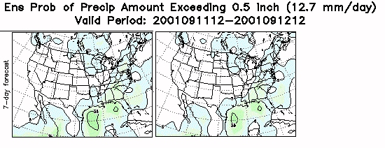
PLAN VIEWS - PROBABILITY PLOTS
Another way to view discontinuous fields like QPF are by displaying their PROBABILITIES.
The probability of a specific threshold being exceeded (say .25" QPF) is obtained by counting up the number of members that actually meet or exceed that threshold, and then dividing by the full numbers of members in the ensemble.
For example, if in a 10 member ensemble - 4 members forecast at least an 1" at a grid point, your probability of recieving 1" at that grid point is 4 divided by 10 or 40%.
THESE ARE NOT CALIBRATED, but strictly based on the raw output from the EPS.
Here is an example of a probability plot for 1" QPF.
Notice the only place on this map at this forecast hour where the ensemble output suggests there is any probability of getting at least an inch of rain is in southern Alabama and the panhandle of Florida. The shaded colors indicate the probability is only 10-20% in the light blue and from 30-40% in the dark blue.
We have concentrated on visualization techniques and interpretation for output on a large scale.
Viewing ensemble output at a point requires different visualization techniques for operations.
Plumes are a useful way to display ensemble data at a point (specific city, observation site, etc.)
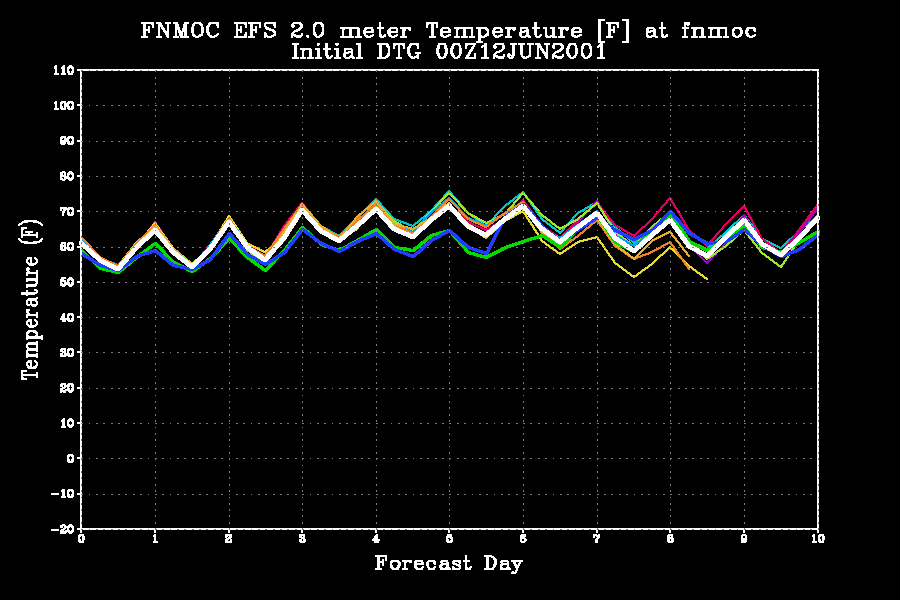
The X-axis denotes forecast day and the Y-axis indicates temperature in degrees C for FNMOC at Monterey, CA.
Each member's temperature trace is plotted in a different color. You can see how the members diverge in solution out beyond day two and a half.
These kind of
plots
are called "plumes" as they are analogous to a plume of smoke spreading
as it is carried down wind.
POINT DATA - BOX AND WHISKER PLOTS
Another way to
view
data at a point is by box and whisker plots.
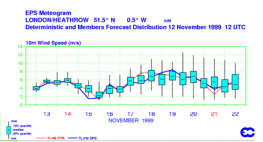
The blue boxes represent values from the 25% quartile (bottom of the box) to the 75% quartile (top of the box) with the median of the ensemble as a horizontal line in the box.
The whiskers extend to both the max and min values supplied by the EPS output. This allows you to instantly ascertain the uncertainty and the median (not the mean) in one view.
In a sense, box
and
whisker plots are plumes (as evident by the increase in spread of the
whiskers
as your forecast hour increases).
The ensemble
approach can also be applied to a particular output parameter from a
deterministic model run. Precipitation
type (ptype) is not typically a direct output parameter of a
model, rather it is derived by post processing the model output via an
algorithm. There are many ptype algorithms (since there is no
single algorithm that handles all ptypes in a sufficient manner).
Some ptype algorithms handle snow better than sleet while others handle
freezing rain better than snow - etc. One approach to the
ptype problem is to run numerous different algorithms using one model's
output. At NCEP HPC four precipitation type algorithms are
applied to NAM and GFS model output. This results in 4 different
opinions of ptype at a given point per forecast hour - for each
model. For example, if three of the four algorithms
indicate a ptype of snow at fhr 30 for the NAM model over Cheyenne
Wyoming - the most probable ptype is displayed as snow. The most
probable ptype is displayed appropriately for each forecast hour of a
given model (see below).
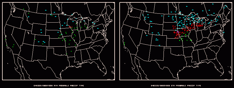
(click here for a movie loop of the above
still image)
VISUALIZATION AND INTERPRETATION SUMMARY
There are a number of ways to display EPS output. There are other ways to display data not shown here as well. Those shown above are the most popular not only in the NWS, but also at other meteorological centers as well (CMC, ECWMF, UKMET). Ultimately you can decide which will most benefit your site's operations.
Although we've described in theory the validity of an ensemble approach to forecasting, you may be wondering if there are any verification results that show if this method is really worth it's spit in operations. Although the figures below are from older data sets, the concept and results still hold true.
Verification conducted not only by NCEP, but also at other national centers (ECMWF and UKMET) as well as the academic community have clearly demonstrated the advantages of using ensemble output over the classical deterministic method.
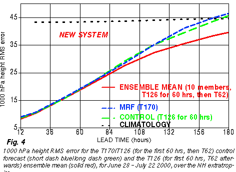
A NCEP study illustrates the practicality of using the ensemble mean over the operational member for heights fields at the medium to long ranges. As of early 2004 the turning point of when the NCEP GFS ensemble mean offers a significant advantage over the operational output (GFS) begins at day 3.5.
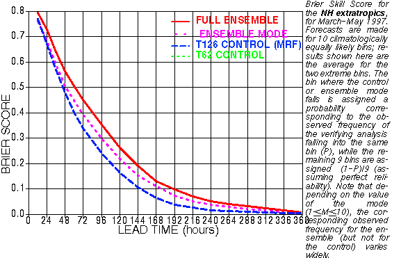
Verification
of Ensemble Mean (in Red) vs Operational MRF (blue) using Brier Score
Forecast hour
is on the bottom. Although the scores rapidly drop off as
forecast
hour
increases,
the Ensemble Mean at 120 hours has the same score as the Operational
MRF at near
84 hours. The Ensemble Mean offers a 36 hour advantage over the
operational
member.
Another study
from
NCEP regarding the possibility of the combined use of the latest set of
ensemble forecasts and the 12 hour older set of ensembles (from the
previous
run) revealed that the ensemble mean pattern anomaly correlation, rms,
and probabilistic verification scores indicate that the inclusion of
the
12 hour older members degrades the quality of the ensemble until
132-168
hours lead time is reached.
Apparently the
disadvantages
resulting from the inclusion of less skillful older members outweighs
the
advantages of having more members until 6-7 days lead time or so.
Therefore
it is recommended that for the first week only the latest set of
ensemble
members are used in forecast applications.
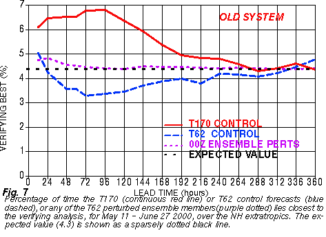
In addition, the high resolution control member is the best member of the ensemble ONLY ~ 5 to 7% of the time for all lead times (forecast hours).
ENSEMBLE MEMBER SIZE VS MEMBER RESOLUTION
Verification has
also brought to light the issue of how to most efficiently utilize
computational
resources. Which gives us more useful information - an
increase
in the members of the ensemble or increasing the resolution of the
model
? Studies from the University of Arizona by Dr. Stephen Mullen
effectively
illustrate this issue.
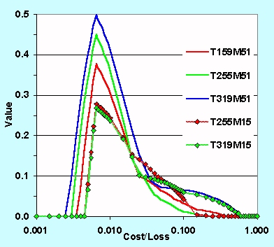
The graph above
shows forecast value as a function of cost/loss ratio for different
ECMWF
based ensembles. The colored curves indicate the resolution of
the
ensemble members and number of members for a given ensemble. This
figure suggests there is just as much value with a 51 member ensemble
at
T159 resolution (solid red curve) as an ensemble with only 15 members
but
a resolution of T319 (dotted green curve). For reference our the
MRF is currently at T170 resolution.
Verification results such as the above also suggest that a loss of accuracy resulting from lower model resolution can be recovered by using the ensemble approach to forecasting.
A study conducted by Richardson (1999) from the ECMWF revealed that an EPS comprised of members derived from multiple meteorological centers (both analyses and output from the MetOffice - United Kingdom and ECMWF) consistently outperformed the ECWMF EPS with probabilistic predictions.
This finding is supported by a study from the University of Arizona. The results hint that an ensemble derived from multiple models (a super or grand ensemble) may actually verify better as compared to an ensemble derived from one model.
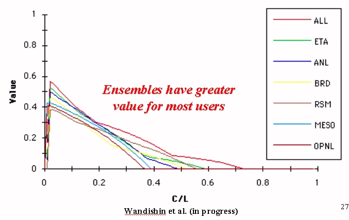
The graph
above shows "value" of the short range ensembles. Note the
combination
of the models (ALL curve) has the greatest value.
Other similar studies such as that completed by NSSL and the University of Arizona by Wansishin et al. (2001) reinforce this finding not only with mass fields, but for QPF as well.
NCEP is
capitalizing on this finding by combining resources with the Met
Service of Canada (MSC) to generate the NORTH AMERICAN
ENSEMBLE FORECAST SYSTEM (NAEFS)
This system combines the outputs from the NCEP Global Ensembles and the Canadian Ensembles into a joint ensemble that creats output for all of North America.
Ensemble output is still model output and therefore is subject to systematic error (bias) like the deterministic output. Forecasters then can modify the ensemble output by experience or objective aids derived from verification.. just like they would with operational model output.
Some useful examples of objective methods to create more useful output for operations includes something called normalized spread. Since spread tends to increase toward the earth's poles, it is quite useful to remove this bias from daily spread charts.
Here is an
example
of an uncalibrated plot of mean and spread (left) compared to the
"Normalized
Spread" (right)
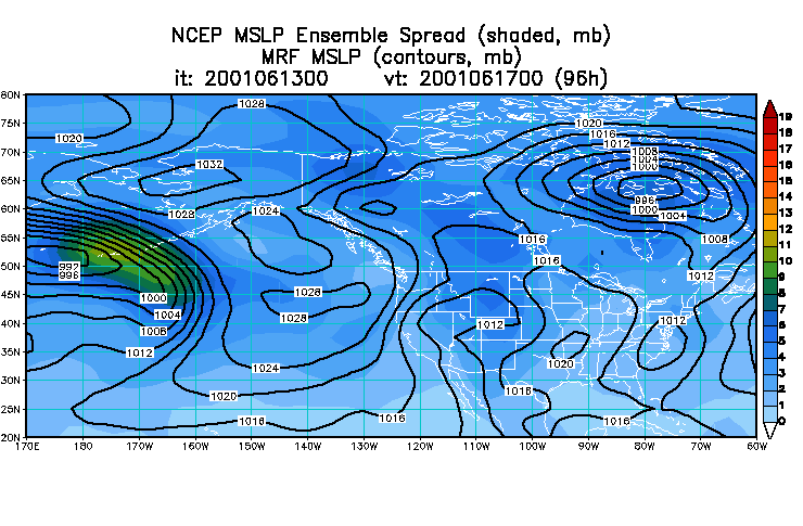
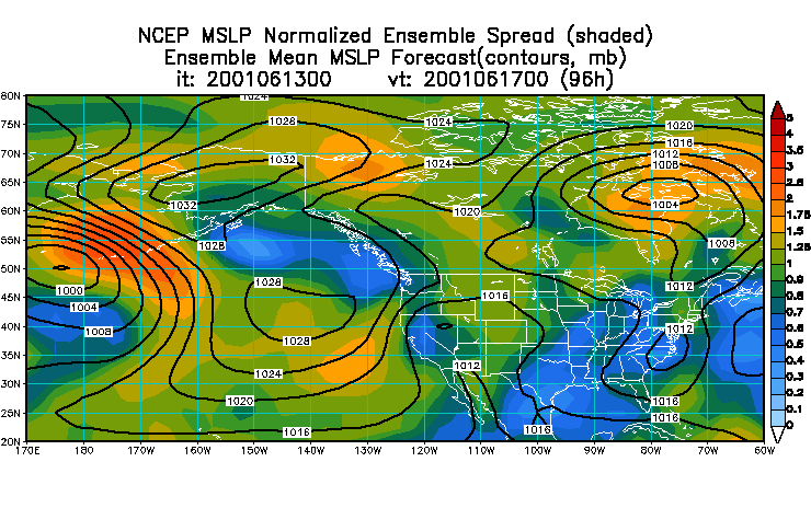
Normalized
spread is computed by averaging the spread values at every grid point
separately
for the most recent 30 days, for each lead time. Today's ensemble
spread
then is divided by the average spread (for each grid point and lead
time
separately). Normalized spread values below/above 1 represent areas
where
today's spread is below/above the typical spread over the most recent
30
day period, With this normalization the effect of different lead
times and different geographical areas is eliminated. Consequently the
forecasters can identify areas with below and above average uncertainty
in the forecast at any lead time and at any geographical location.
NCEP EMC also calibrates the spread by using verification.
These plots below show the ensemble mean in black, but instead of displaying the raw spread (as we did in the above plots), we get a sense of the uncertainty by how the ensembles have been verifying. The verification history is used to normalize the spread such that any where you warm colors (reds/yellows) indicates relatively higher predictability and cool colors (blues) represent lower predictability. HOWEVER, these are a function of forecast hour. For example a red shade represents a different probability of verifying for different forecast hours.
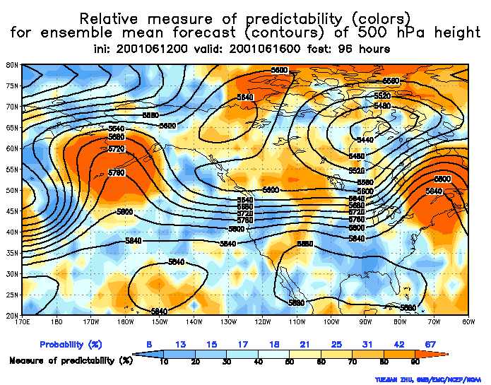
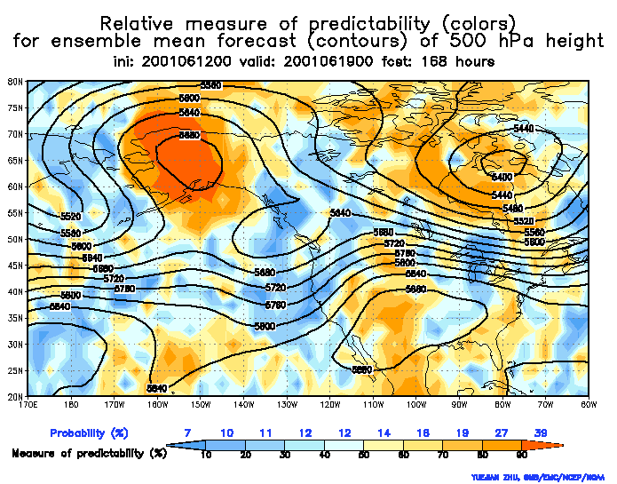
Notice how the ridge over Alaska features red shading in both plots (96 hours and 168 hours). At 96 hours the red shade represents 67% probability of verifying whereas at 168 hours it only represents a 39% probability of verifying. So although on each map this feature has the highest probability of verifying, the probabilities vary by forecast hour (typically less probability as forecast hour increases).
These charts assume that any feature depicted has climatologically a 10% probability of verifying in nature. The Relative Measure of Predictability charts shows based on the ensemble forecasts how far above this climatological chance of 10% you have of actually seeing this feature verify at that forecast hour.
So then, the simple interpretation of the 168 hour plot is that the ridge has less spread or more certainty than any other feature on the chart. BUT keeping in mind that any feature on the map has a 10% probability of verifying just by climatology, at 168 hours the calibrated probability indicated it actually has got a 39% chance of verifying. Thirty nine percent. That stinks you may say, but it is almost 4 times greater than the climatological probability.
Bias is also being removed objectively from the EPS output. This is done by calculating the bias from the past 30 days of output (such that verification from 1 day ago is exponentially weighted more than the verification from 30 days ago).
Here is a sample
plot with the uncalibrated PQPF from the NCEP Global EPS on the left
and
the same with the bias removed on the right.
Results can be subtle, but notice this reduced the probability of receiving .5" of QPF over Arkansas.
Finished ? Well, not really. This was a crash course in EPS and there is a lot of information that was not covered.
This is an evolving science and as computing power and verification efforts increase and change, so too will the techniques to produce and visualize ensemble output.
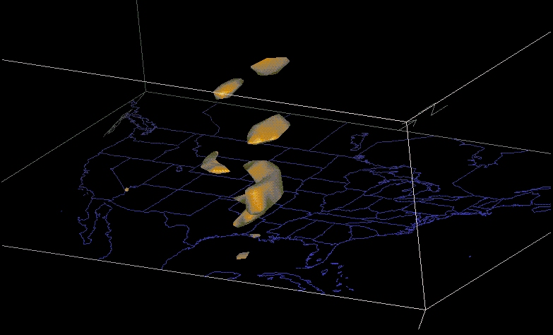
Ensemble
output
as viewed via VIS5d. Each members output (here QPF for .25"
threshold)
is treated as a grid on a different vertical layer allowing a forecast
to view all solutions in a three dimensional fashion.
At this point your office should continue on with EPS training tailored specifically to your site's operations.
EPS
INFORMATION
ON THE WEB
FORMAL COMET
TRAINING MODULE located at http://meted.ucar.edu/pcu1/ensemble
NCEP GLOBAL
ENSEMBLES
are located at http://wwwt.emc.ncep.noaa.gov/gmb/ens
NCEP GLOBAL AND SREF ENSEMBLES via nice GUI from NWS State College (courtesy SOO Rich Grumm) at http://eyewall.met.psu.edu/ensembles
NAEFS OUTPUT located at NORTH AMERICAN ENSEMBLE FORECAST SYSTEM (NAEFS)
NCEP SREF ENSEMBLES are located at http://wwwt.emc.ncep.noaa.gov/mmb/SREF/SREF.html
CANADIAN (CMC) ENSEMBLES are located at http://weatheroffice.ec.gc.ca/ensemble/index_e.htmlNAVY (FNMOC)
ENSEMBLES
are located at https://www.fnmoc.navy.mil/PUBLIC/ (click
Ensemble Forecasts/EFS Plumes on the left menu)
SOURCES UTILIZED TO COMPOSE THIS MANUAL (NOT QUITE REFERENCES)
Gleick, J., 1987. Chaos, Penguin Books, 352pp.
Legg, T. P., K. R. Mylne, and C. Woolcock, 2001: Forecasting Research Tech. Report No. 333.
Lorenz, E. N., 1963: Deterministic Non-Periodic Flow. J Atmos. Sci., 20, 130-141.
Richardson, D. S., 1999: Ensembles Using Multiple Models and Analyses: Report to ECMWF Scientific Advisory Committee.
Sivillo, J. E., J. E. Ahlquist, and Z. Toth, 1997: An Ensemble Forecasting Primer. Wea. Forecasting, 12, 809-817.
Toth, Z., 2001: Ensemble Forecasting in WRF. Bull. Amer. Meteor. Soc., 82, 695-697.
Tracton, M. S., and E. Kalnay, 1993: Operational Ensemble Prediction at the National Meteorological Center: Practical Aspects. Wea. Forecasting, 8, 379-398.
Wandishin, M.S., S.L. Mullen, D.J. Stensrud, and H.E. Brooks, 2001: Evaluation of a short-range multi-model ensemble system. Mon. Wea. Rev., 129, 729-747.
Wilks, D. S., 1995. Statistical Methods In The Atmospheric Sciences, Academic Press, 467pp.
First, I am grateful to God for granting me what I needed to complete this reference (He always gives me more than I deserve).
Dr. Louis Uccellini (NCEP Director) - for being the impetus behind the NCEP SOO Conference on Ensembles held in November of 2000 which ultimately led to this manual.
Ed Danaher (NCEP HPC Development Training Branch Chief) - for allowing me the time to work on this manual.
ZOLTAN TOTH (SAIC Scientist at NCEP EMC) - for being a resource on this manual's material, being patient with my questions, and reviewing this manual.
STEVE TRACTON (formerly NCEP EMC) - for being a resource on this manual's material, being patient with my questions, and reviewing this manual.
KEITH BRILL (NCEP HPS Development Training Branch) - for being a resource on this manual's layout.
All the attendees of the NCEP SOO Conference not mentioned above who had input on the content of this manual -
Jon
Ahlquist
FSU
Jordan
Alpert
NCEP EMC
Kirby
Cook
NWS SEW
Paul
Dallavalle
NWS MDL
Mary
Erickson
NWS MDL
Jiann-Gwo
Jiing
NCEP TPC
David
Helms
NWSH
Jun
Du
NCEP EMC
Preston
Leftwich
NWS CRH
(retired)
Francois Lalaurette ECMWF
Russell
Martin
NCEP CPC
Frederick
Mosher
NCEP AWC (retired)
Ken
Mylne
MetOffice (UK)
Steven L.
Mullen
U AZ
James A.
Nelson
NWS WFO SLC
James
Partain
NCEP ARH
Richard J.
Pasch
NCEP TPC
Russell Schneider
NCEP SPC
Michael Staudenmaier NWS WFO FGZ
David J.
Stensrud
NSSL
Joshua
Watson
NWS ERH
Steven J.
Weiss
NCEP SPC
Last updated
7/19/06