You may be wondering how well the experimental HeatRisk works in identifying climatologically dangerous levels of heat that could lead to increased heat-related impacts. Since it was initially developed in the Western United States, you also might be wondering if it even works in other locations. You also might wonder why include minimum temperatures in the approach? To help answer these questions, we’ve examined a few different datasets to illustrate how HeatRisk has been verifying.
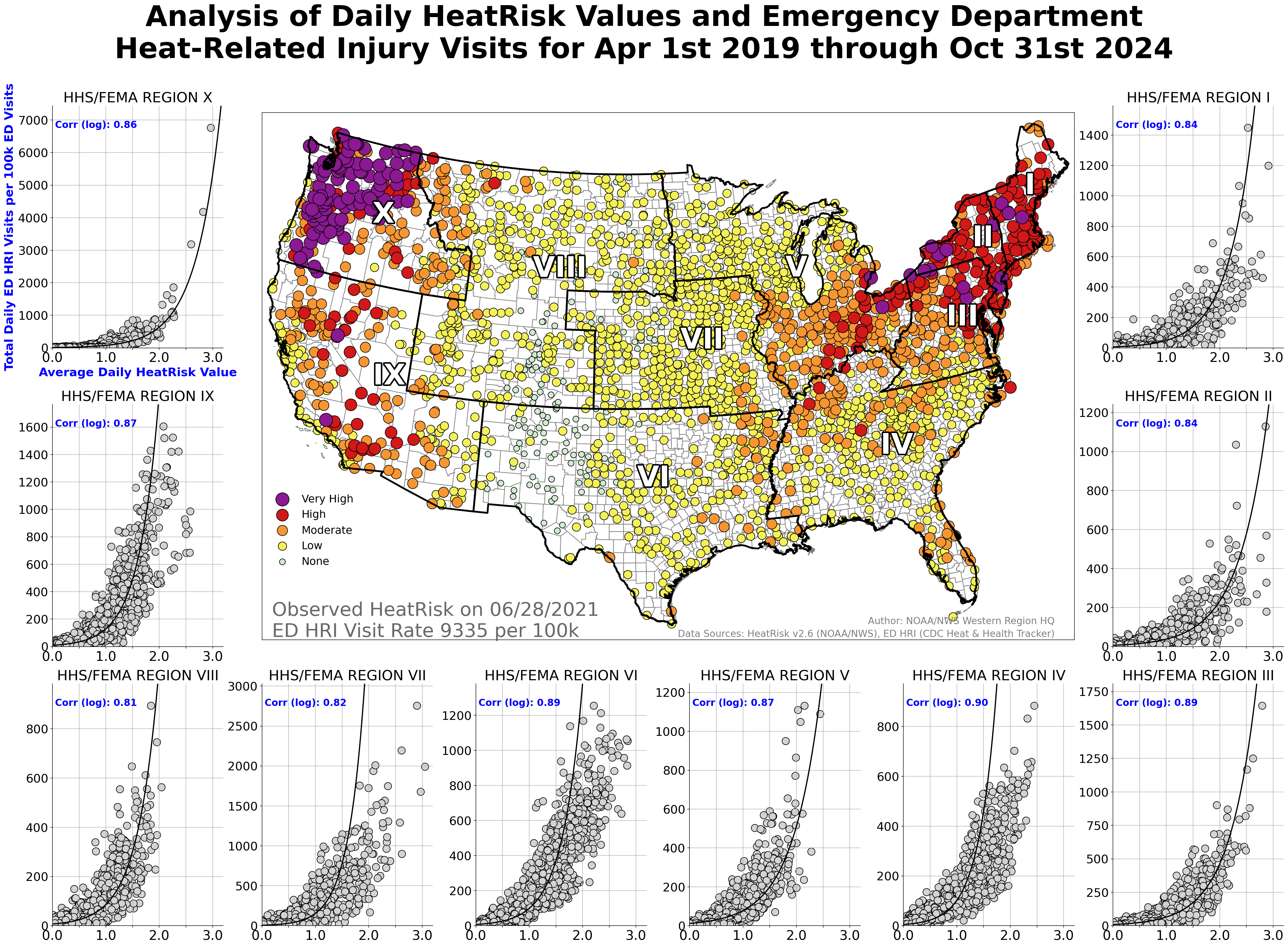
This first example examined emergency department (ED) heat-related injury (HRI) data (which is expressed as rate per 100k ED visits) obtained from the CDC Heat & Health Tracker Page This is tremendous data to look at as it clearly represents acute heat impacts - someone became ill from heat at a specific time and location and sought medical attention.
These data are combined in ten regions across the contiguous United States, based on FEMA regions. In the figure below, we compared the daily regional HRI data against the average observed HeatRisk data in each FEMA region for the combined six full heat seasons from April 1 - Oct 31 2019-2024. Each FEMA region has its own chart plotting the data, including the logarithmic correlation. The center map shows the day with the highest overall HRI rate and serves as a good example of what the individual HeatRisk values were at the NCEI locations that are used for point verification purposes.
For reference, we in the weather and climate world get excited when we see correlation scores above 0.75. You'll see there is strong correlation between HeatRisk and the ED HRI dataset across all regions, with the lowest correlation score being 0.81 in FEMA Region VIII, and the highest correlation score being 0.90 in FEMA Region IV. This is a great indicator of the utility of HeatRisk, and not just for the big warning days but all those other times when less widespread, but still important, impacts are happening. And, it also shows that HeatRisk has been doing quite well over this six year period across the entire country, not just in the Western United States, in identifying the bigger events in each region.
It’s no surprise to anyone that the deserts of Arizona have many hot days. Some even question why issue heat warnings or try to identify the more dangerous days? This second example examined the daily share of annual emergency department visits due to heat-related illness in Maricopa County, AZ, shaded by the day's HeatRisk value (as observed at the Phoenix International Airport - KPHX).
In the figure below, days with stars indicate when an Excessive Heat Warning was in effect. Daily high and low temperatures are provided for reference. As background, NWS Phoenix has established a deep relationship with the Maricopa County Department of Public Health to have access to this high quality and rapidly updating dataset. NWS Phoenix also strongly considers HeatRisk output when determining when to issue their heat products.
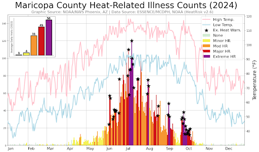
While nothing is ever perfect, HeatRisk did identify the majority of the “spikes” in emergency department visits with orange or higher values. The most extreme peaks were captured fairly well by red or higher values. This verification dataset also reconfirms the fact that heat-related impacts do happen at levels below traditional warning thresholds, illustrating the importance of having a heat service with multiple thresholds, in addition to our traditional heat product suite.
The third example looked at the number of calls received each day by the City of Phoenix Fire Department for heat-related services, shaded by the day's HeatRisk value (again observed at KPHX). Days with stars indicate when an Excessive Heat Warning was in effect. Daily high and low temperatures are provided for reference.
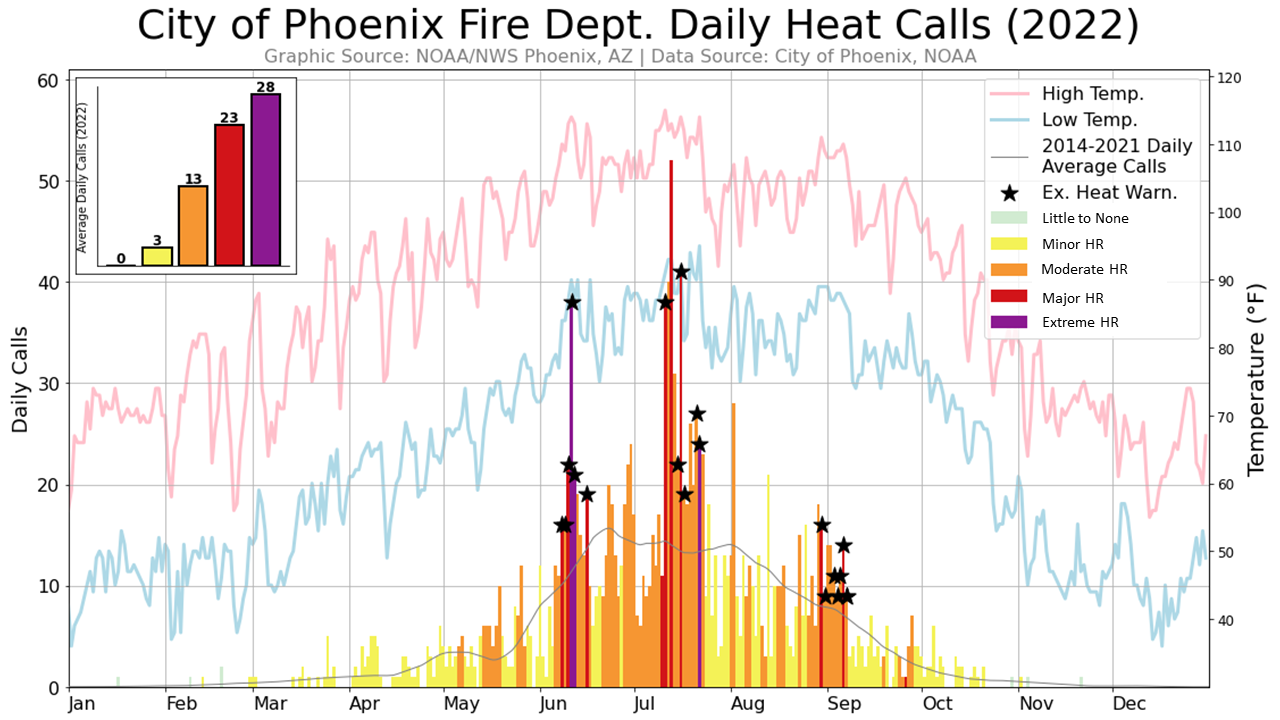
Again, while not perfect, HeatRisk did identify many of the “spikes” in the City of Phoenix Fire Department heat-related calls with orange or higher values. The most extreme peaks were captured fairly well by red or magenta values. This independent dataset again illustrates that heat-related impacts can happen at temperatures well below our traditional thresholds, even in an excessively hot climate, and that a heat service like HeatRisk can provide valuable information to improve awareness and aid in heat-related decision making.
This last example looks at the value of having both maximum and minimum temperatures as part of the HeatRisk approach. The graphic below again looks at the City of Phoenix Fire Department heat-related calls, but plots this data from 2014-2022 against the HeatRisk individual contributions from maximum temperature and minimum temperature (which we then combine to provide the 24 hour value you see as the official value on this webpage).
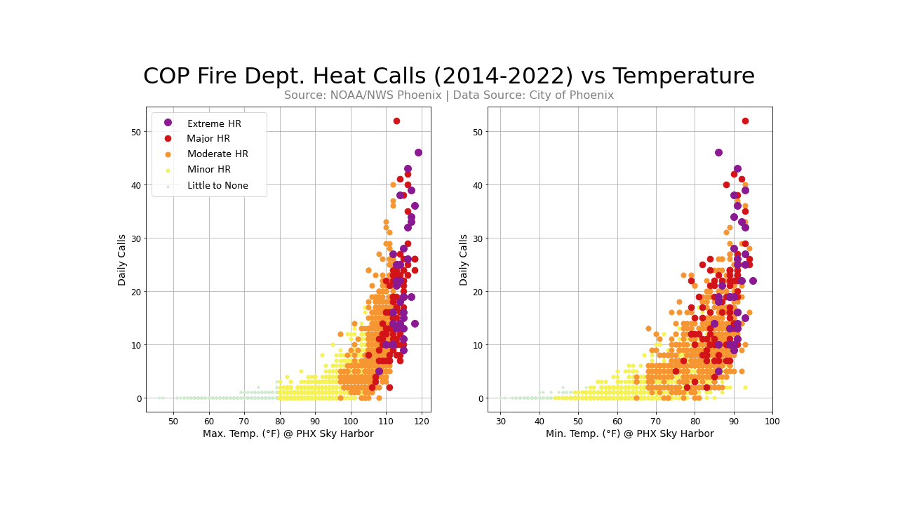
These plots clearly show that there is a robust relationship between daily calls and maximum and minimum temperatures independently, and that they should both provide useful information to inform the overall 24 hour HeatRisk value when combined (as was shown in Example #3).
Hopefully you are more convinced that HeatRisk provides a valuable service and indeed is capable of identifying climatologically unusual heat events which have significant impacts. These datasets also illustrate that heat-related impacts can and do occur below our traditional heat alert thresholds and that the HeatRisk service provides a way to identify those still impactful periods as well. It isn’t perfect, and not all heat-related impacts will have such strong relationships. However, these datasets explored here do present a strong case that HeatRisk is providing a valuable service and does identify climatologically unusual and impactful heat events.